Power BI Design Techniques
Power BI design settings for metrics, bar charts, maps, and other visuals.
Layout Techniques
Color Palette
- Explore trending color palettes using Coolors
- Pick a palette and copy/paste the color codes to the report/visuals
Align/Resize visuals
- Select multiple visuals that need to be aligned
- Go to
Visualizations/Format visual/General/Properties - Update any of these settings: Size, Position, Padding
Whitespace hack for padding
- I wish PBI visuals had a similar behavior as the Box Model in CSS with padding, border, and margin
- Create a shape of the same background color as the visual
- For example:
Insert/Shapes/Rectangle Resizethe shape to the same size as the visual- Add 20px to the shape’s height and width
General/Properties/Size
- Add 20px to the shape’s height and width
- Add
rounded corners- Select the visual, then
General/Effects - Set
BackgroundtoOn- Set same color as the shape’s background
- Set
Visual BordertoOn- Set same color as the shape’s background
- Set
Rounded cornersto15px
- Select the visual, then
- Add
shadow- Set
ShadowtoOn- Change the color to a ligher setting than the default
- Set
PositiontoCustom- Set
Transparencyto90px
- Set
- Set
- For example:
- Organize the layers so the shape is behind the visual
View/Selection/Layer order- Rename the layer with a proper name
- Or use
Format/Send backward(when selecting the visual)
- Make sure the shape’s color is the same as the visual’s background
- Turn shape’s border to off
Format painter to copy/paste a format
- Click on a visual
- Under the Home menu tab
- Click
format painter - Use paintbrush mouse pointer to click on a similar visual
- This will copy/paste the format to that visual
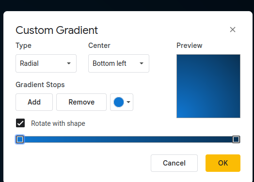
Gradient Blue Background
If you want to create a background with a gradient to have better contrast and a modern design, you can use an external image and use it as a background.
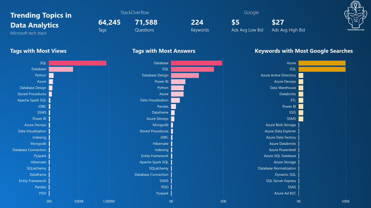
More about this report in Power BI with Azure and Data Analytics Trends
Power BI Canvas Settings
- Review the canvas size
- The default is type
16:9(height: 720px, width: 1280px)
Google Drive
- Create a Google Slide
- Set the page setup to
16:9or selectCustomand enter the size in pixels - Change the background
- Select
color - Go to the
Gradienttab - Add a custom color
- Select any preferred settings
- Download the slide as
.svg
Power BI Canvas background
- Without clicking any visual
- Go to the menu Visualizations, then the tab
Format page - Click
Canvas background - Click on
Imageand upload thesvgfile- Set Image fit to
Fit - Set
Transparencyto0
- Set Image fit to
Designs for Visuals
Report Text Box Title
- Header: Segoe UI, 18px, Bold
- Subheader/description: Segoe UI Light, 11px

Multi-row Card
- Header
- Visualizations/General/Title
- Heading: Heading 3
- Font: Segoe UI Light, 12px
- Values
- Visualizations/Visual/Callout values
- Font: Segoe UI, 18px, Bold
- Labels
- Visualizations/Visual/Category labels set to
On - Font: Segoe UI Light, 11px, Bold
- Visualizations/Visual/Category labels set to
Stacked Bar Chart
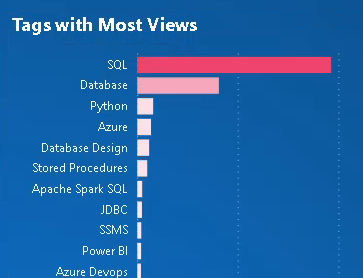
- Header
- Visualizations/Format visual/General/Title
- Heading: Heading 3
- Font: Segoe UI, 14px, Bold, Left alignment
- Y-Axis, X-Axis
- Visualizations/Format visual/Y-axis/Values
- Font: Segoe UI, 9px
- Max area width: 50%
- Concatenate labels: ON
- Gridlines
- Style: Dotted
- Color: Light grey
#C8C6C4 - Width: 1px
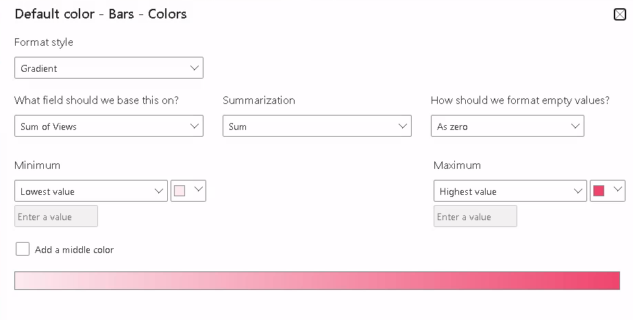
- Bars/Colors
- Conditional formatting
- Format style: Gradient
- What field based on: Sum of Views
- Summarization: Sum
- How to format empty values: As zero
- Minimum: Lowest value
- Maximum: Highest value
- Bars/Spacing
- Inner padding: 20px
- Min category width: 20px
Make a slicer look like a website menu
- Select the slicer
- Format visual/Visual
- Slicer settings
- Options/Style set to
Tile
- Options/Style set to
- Values
- Font/padding
4px
- Font/padding
- Border
- Bottom
- Set a color and line width like 10px
- Background
- Set the same color as the top bar
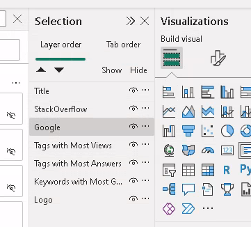
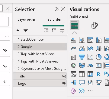
Organize the Layers
As you add visuals to the report, you can organize them in layers, and name the visuals with a naming convention.
- Go to
View - Then
Selection - A vertical menu opens with two tabs
Layer orderandTab order - In
Layer order, rename the visuals - Drag/drop the visuals on top of each other
- Optionally, hide visuals
- This
show/hidecan also be used when creating bookmarks - Create two visuals on the same canvas location
- For example,
sales by yearandsales by month - Place the layers so they are exactly on top of each other on the canvas
- When creating a bookmark hide one of the visuals and save it
- Then swap show/hide for the other visual and create another bookmark
- This
Visual Tab Order
The adjacent tab says Tab order and it shows this message when you browse over:
Choose the way people tab through your report elements and hear them read by a screen reader.
You can order visuals by drag/drop and choose to hide visuals from this tab browsing.
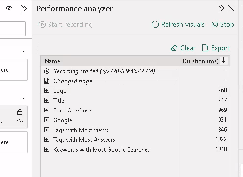
Performance Analyzer
- Click on a new a report page
- Click on the Optimize menu tab
- Then
Performance AnalyzerandStart recording - Go back to the report
- It shows the duration it takes to execute each layer
- Hidden visualization layers don’t get loaded
View/Selection/Layer order - Expand any element in the analyzer to review duration of each element in a layer/visual
Microsoft has this document on data reduction techniques, which in a way summarizes to this:
From faster to slower
Star schemas, measurements
- Use a DW at the source with data marts, star schemas, and measurement/summary/date tables
- Use Power Query M to create star schema, transformations, and measurement tables
- Use DAX to create tables and measurements
Storage mode, importing data
- Set Storage Mode to DirectQuery and a SQL script to load only what is required
- Large datasets, real time analytics
- Set Storage Mode to Mixed Mode and a SQL script
- Set Storage Mode to Import and a SQL script
Set Storage mode per table
- Go to
Model view - Select a table
- Go to
Advanced - Select
Storage mode- You can switch from DirectQuery to Import
- You cannot switch from Import to DirectQuery