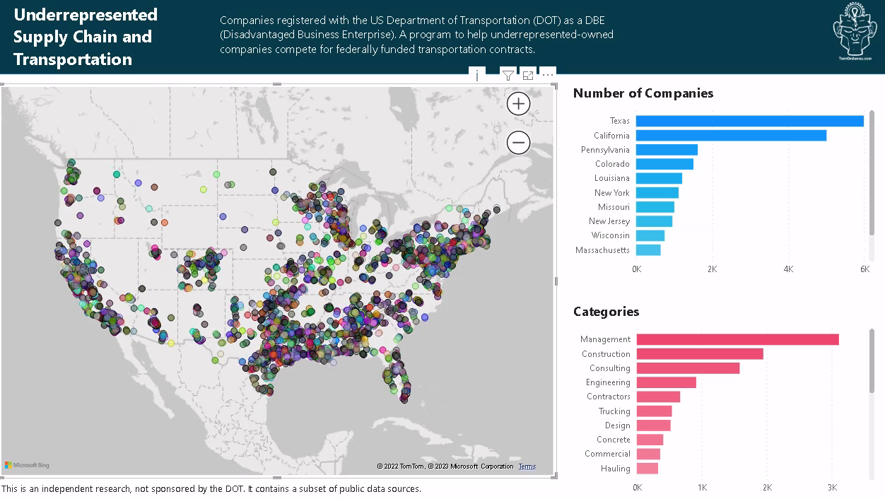
Power BI Dashboard of Underrepresented Companies
Every US state has a DOT website about underrepresented and minority-owned companies also known as DBE or Disadvantaged Business Enteprise. This is the dashboard to visualize these companies by region.
I previously wrote about the ETL process of this dataset in Creating a data pipeline with Azure Data Factory. Here is a summary:
- The US DOT has a website listing all DBE websites by state. But most links are broken and outdated.
- I created a data pipeline using Azure Data Factory, built ETL process using PowerQuery, and joined the output to an Azure SQL Database.
- Below are the details of creating the dashboard to visualize this dataset.
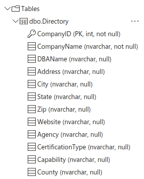
Database schema
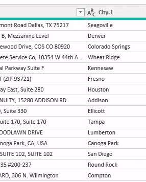
First transformations
- Added a leading zero in those states like
MAwhere the database did not store the values correctly. - Removed State and Zip values from the City column.
- Removed the Address column. Such level of detail was not required and it contained too many inconsistencies.
Exploratory data analysis
I queried the database to see the number of rows:
SELECT COUNT(CompanyID) FROM [dbo].[Directory];
Result: 25,490
Loaded the dataset into Power BI from the Azure SQL Database. Then created a map visualization using the zip code. However, it displayed the usual incorrect countries.
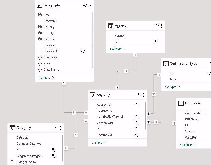
Star schema
- Created dimension tables for
Geography,Agency,Certification Type,Company, andCategory - Joined
Geographyto a dataset of zip codes to find the latitude and longitude.
Other transformations
Other transformations in Power Query took a long time, since the columns were not completely clean, and visualizing the data showed inconsistent results.
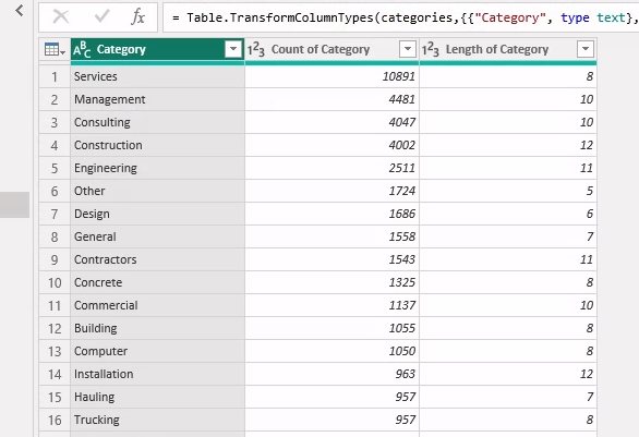
Extracted a list of categories for the Category table using Python inside Power Query. Extracted all the words from each company description and ranked the list by count of words. Then assigned each company the highest ranked category.
How to use Python in Power Query
Create the Python script in Google Colab
Power Query depends on the Pandas library. Create a script that uses Pandas.
- Create and test the Python script using Google Colaboratory. Although keep in mind these are run on GPUs on Google Cloud Platform. Running the same script in Power Query will depend on your hardware and might take much longer to run.
- Ideally, instead of using Python or M in Power Query, try to make these changes at the source in SQL with a view or materialized view if this is a SQL Server.
- Once the Python script is tested and works as per your requirements. Go to Power Query.
Setup Python in Power Query
Install Python. There are many tutorials on how to do this. For example in Windows:
- Go to the official Python website and download the installer
- Install the exe file, select all dialog boxes, included adding to
PATH
In the command prompt install Pandas:
pip install pandas
This one is not required, unless you want to create plots using Python:
pip install matplotlib
In Power BI, settings, go to Global then Python scripting and verify the location folder where Python was installed.
Setup the Python script in Power Query
- After creating a query to load a dataset. Go to Transform, then
Run Python Script - It might have a comment to use
datasetas the input dataset that was loaded into Power Query - Paste the Python script to the text box
Import pandas and any other libraries used in the script:
import pandas as pd
Verify that you are loading the dataset correctly.
For example. In Google Colab I loaded the dataset like this:
df = pd.read_csv("/.../some-file.csv")
In Power Query this won’t work. You need to create a dataframe with the dataset:
df = pd.DataFrame(dataset)

Run the script and set the permissions for the script. These have to match the privacy of your dataset. If your dataset is Organizational then the Python script has to be set to the same.
A table is created showing the dataframes in the script.
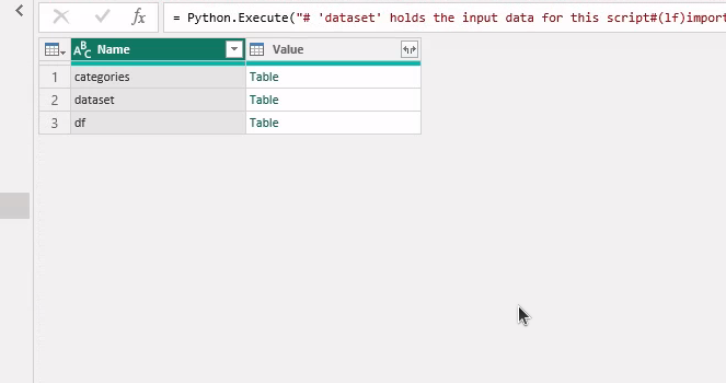
Click on the resulting Table value to expand it.
Create the visualization
- Created map and barcharts. Verify that all visuals are stacked correctly.
- Go to View/Selection/Layer Order. Organize visuals up/down and rename them.
- Fix the layer order of all visuals. Select each layer. Then Format/General/Properties/Advanced Options, set
Maintain layer ordertoOn - Hide visuals from the tab order that don’t require navigation
Create a custom tooltip in another page
Setup the tooltip
- Create a new page
- Visualizations menu/Format page
- Page information
- Enter a name
- Set
Allow use as tooltiptoOn
- Canvas setting
- Type: Tooltip
- Vertical alignment: Middle
- Canvas background and Wallpaper
- Transparency: 0
- Page information
- Add information/visuals to the tooltip
- Right click on the page tab and set to
Hide page
Use the tooltip
- In the visualization page, select the visual
- Go the Visualization menu/Format visual/General/Tooltips
- Type: Report page
- Page: Select the page where you created the tooltip
- Go to Visualization menu/Build visual
- Under
Tooltipsit should show the tooltip that was created
- Under
Final Dashboard